http://www.blogger.com/template-edit.g?blogID=27684744 ARTYFACTS: November 2007

Tuesday, November 27, 2007

Zabludowitz Collection

Anita Z was born in Newcastle and studied at Newcastle College of Art and Technology but it is her husband, the property billionaire who supplies the loot for her collection. The good news is that she’s committed to the public display of her acquired works.

As one would expect, it’s a bit of a mish-mash. I could have done without the Hulusi walls. They’re annoyingly oppressive and distracting. It dilutes the whole collection.

The Boo Ritson, she of painted faces fame, is a great start, although even Boo Ritson is descending into celebrity pieces, which would be a shame. It would be great of artists were a little less sycophantic towards collectors. I would have lathered her in green paint (the colour of money).

Manu von Kohler’s giant soldier kit is pop art at its best. Broken mirror handbags, video installation, scaffolding and paint tins are dull and mute. Gilbert and George make me want to reach for a sledge hammer.

An interesting game in collections such as these is to guess the name of the work. ‘Untitled’ is a good bet.

Kendell Greers (Baltic)

Geers works are made to shock but art designed to shock is often tamer than the artist thinks. The police baton star is by far the best piece as it is both beautiful and full of violent intent. The taped crucifix, a sort of Prometheus Bound image, takes you by surprise but the taped skeleton, just a couple of yards away then seems like a second-hand idea.

The broken glass with brick is a neat and curious work but the padlocks, heads in a bag and other ephemera are, to be frank, puerile. Walking through the crucifix-shaped corridor of body bags was unnerving. Orange has become the colour of evil after Guantanamo.

As for the car on a plinth protected by broken glass – neither shocking nor surprising if your familiar with housing estates in the UK. The obligatory skull has been commodotised in art for so long that it seems commonplace and dull.

Baltic blogger

Newcastle’s ‘Baltic’ is its Tate Modern, but their bridge (Gateshead Millennium Bridge) is better. Its shark-jaw design looks as though it's ready to bite ships in half as they come up the Tyne. The Baltic is a tall building with six floors and much easier to navigate than the Tate Modern, with better views and a more open feel.

Mark Tichner has decorated the foyer, but I’ve never liked his slogans, sneers and platitudes. The viewing gallery is a great spot with a lonely Gormley figure and Spencer Turch photograph of a thousand Geordie nudes freezing their bits off at the Sage.

The star of the show is Newcastle. It was deserted on the Tuesday afternoon but a great place to wander about. I’m back in December and already looking forward to the trip. London bound art lovers don't know what they're missing.

Wednesday, November 21, 2007

William Kentridge

Inside out
Great to see visual art literally 'turned out' to be visible from the street, and not cooped up in the dull interior of the gallery. A set of large screens in the windows show black and white films all night (questionable environmentally). So far, so good - making the walls of the gallery the art itself drew me in. Then it all got a little odd.

Wittgenstein's Rhinoceros
The internal pretension is overwhelming. There's a piece called 'Wittgenstein's Rhinoceros' showing ripped book pages with black brushstroke images of rhinos. It refers to a famous encounter between Wittgenstein and Russell, where the former refused to admit that there was no rhino in the room. In fact, this was an early exchange about the philosophy of mathematics and reference. It is treated here as a simplistic interpretation that adds nothing to the story or general philosophical points. The 'cod philosophical' statement about perception and epistemology on the wall says it all - or rather says nothing, which is all there is here.

The films are similarly dull and the revelatory print in the brochure is overworked and at times pathetic. He runs the films backwards and uses jump cuts to show - well not much. This has all been done before. Far from commentating on genocide and colonial issues, it trivialises these events. There's some stupid wordplay about 'remembering the future', nothing more than words. This is what Wittgenstein hated, the misleading use of language that takes us into apparent profundity, when it is really just language taking us down cul-de-sacs.

The stereoscopic images are of no real import. They are not even remotely interesting as images, and stereoscopic viewing is handled better by digital artists currently working in film.

The charcoal drawings are, frankly, dull and as for the long explanations in small print literally only inches off the ground below the large images - were they expecting literate dogs or leprechauns as visitors?

You may not have heard of Kentridge - don't worry, it's not your loss.

Saturday, November 17, 2007

The Imagined Village (Brighton Dome)

Made in England
Just back from an English folk night. It almost made me proud to be English (this takes some doing as I’m Scottish). Billy Bragg was the funny front-man and had some great musicians on-board. Eliza Carthy was on top form. Barney Morse-Brown gave a fantastic cello solo (unusual at a folk event) and everyone else lifted the whole thing into a fantastic celebration of English song writing. Above all, they avoided the mock-seriousness often associated with folk. It aws a night of laughs and rollicking, good fun. Maybe a little too much talk and not enough music, but a damn fine night out.

Folk lives on in punk
Bragg made sure that that it avoided wallowing in the usual John Barleycorn reminiscing by inserting a dose of electric guitar, Benjamin Zephaniah, Indian musicians and a fine speech on how English folk lives on in the legacy of punk, Joe Strummer and Paul Weller. This is a very interesting idea.

The white English working class may have lost its musical folk heritage as expressed in pub songs, but it lives on in ballads and songs sung by working class bands who often focus on social commentary in their lyrics. They tend to be urban, rather than rural, but it’s the same deal – they sing about what it is to be English.

Bragg mentioned Joe Strummer, Paul Weller certainly, and a tradition that has given us everything from John Cooper Clark to the Arctic Monkeys. He goes on about the English working class a lot, but I didn’t see much sign of them at this concert. No matter, the true audience for folk music are the next generation who simply download the stuff for free and are playing in pubs across Brighton as I write this very piece.

Friday, November 16, 2007

Beowulf

Computers revive Anglo-Saxon literature
Computers are playing more than one role in the resurrection of Beowulf. They have largely created the wonderful movie, can be used to download several text and audio copies (for free) from the Gutenberg Project, and have revealed parts of the poem hidden for centuries by digital analysis.

Performance capture
Animation has become truly animate. The performance capture technology takes real performances (Anthony Hopkins takes the rest of the cast to the cleaners with his facial expressions and intonation alone) a complete body scan allows for emotion capture, and everything else can be added, even, in the case of Winston, an entire David-like body and aging 20 years. Grendel is very Gollum-like, and indeed Tolkein was a serious Beowulf scholar. The special effects also allow the Director to do what he wants in terms of fantasy ideas.
The people look like people, not just because the faces are real, and it is just on the edge of mimicking real physics while allowing one to break the laws of both physics and reality. This is an art-form that has come of age, a combination of imagery that has its roots in both film and computer games.

Other-worldly
An obvious point, but keeping the look and feel slightly unreal gives it a coarse and mythic quality. It seems like another age and not quite of this world. The richness of colour and texture counter the slightly wooden movement of the characters and the long tracking shots, and cameras that can move literally on any path in all three directions, give scope for even more hyper-real trickery.

Odd script
The script is rather odd in that it jumps between styles so often. One minute we’re in the Old English (half-English, half-German) then fictional ‘Beowulf-speak’…, the next we’re in modern colloquial “Fancy a gobble?” (a bit of a surprise that line), then back to Homeric-hero talk. Thankfully, it’s a great story of heroes, monsters and dragons but it flagged a little in places, mainly due to script. Overall, however, a triumph. This should be the compulsory introduction to Beowulf for the English GCSE, although it doesn’t stick to the original plot. These stories were written to be told and spoken, not read. The fact that one can create worlds in such glorious detail is a bonus.

Into The Wild

Haven’t we all just anted to ‘take-off’ sometime, hit the road, forget the past. Alex does this by giving his money to charity, driving West and changing his name. The America he wants is the landscape, the rivers, desert and mountains, what they call the wilderness. In the end, he can’t. He is educated but in the end, his urban background kills him. This urbanised kid fails to fend for himself in the wild, lacking the skills to kills and store meat and using a paperback to spot edible plants, one of which kills him.

But it’s his quest that fascinates. We all want like to think we could drop it all tomorrow but we can’t. It takes courage to give up a careers, work, comforts and civilisation. It is a very caring and moving work about the pain of parenthood and the pain of separation when a young man breaks from his family, and in this case society and rules.

Friday, November 09, 2007

Turner Prize: A retrospective (Tate Britain)

Heard about the unmade bed, shed/boat/shed, room with lights that go on and off, pickled cows and other Turner winners, here's a chance to see the 1984-2006 batch. In stark comparison with the Millais exhibition I attended on the same day, this was full of young people chatting, taking notes and smiling. All of these were absent in Millais, which was more of a National Trust crowd - lots of cut-glass accents, tweeds and supposedly, serious comment.

Quick quiz:
1. In what year did Tracy Emin win the Turner prize?
2. When did Damien Hirst's shark in formaldehyde win?
3. What long journey performance won in 2005?
4. Which famous film actor won?
5. Who won in 1990?
6. Who has won it twice?
(see answers at end of post)

It's the range of media that surprises - beds, glass cases of formaldehyde, rooms, video, pots, paintings, lights, sculptures, moulded concrete. Who cares who won and in what year, the Turner has, quite simply, helped burst open the door to new ideas, as well as stimulate debate on what constitutes art. It's got to be better than the annual party political conferences, debate on the future of A-levels and so on.

Of course, it's the body of work is what counts and it's great to wander round a show where you never see anything that is like anything else.

We have Tomma Abts, who must have given the most boring acceptance speech in the history of the prize, and some claim the most boring paintings. Personally, I've come to enjoy the restraint in her scale, composition and use of colour. Less is more.

Simon Starling's shed come boat come shed is just wonderfully wacky and all about identity and time. Remember that this work was a real act in time. he did build the boat from the shed, sail it down the Rhine and rebuild it. It was a performance.

Jeremy Deller's room was a mite predictable and the fact that the critics and judges were as one on the decision probably means it was trite.

Grayson Perry I loved. Where else would a transvestite (alter-ego Claire) who does beautiful ceramics with worrying slogans and images, beat the Chapman Brothers to the finishing line. How extraordinary. It's a tribute to the UK that we regarded this as a good choice. The pots just blow you away. Who wouldn't want to own these and have them somewhere you could see them every day.

Keith Tyson doesn't do it for me as I don't find the sloganeering even remotely enlightening. I agreed with Kim Howells, the Minister for Culture who signed the book "If this is the best that British artists can produce, the Bristish art is lost. it is cold, mechanical bullshit.." He was right on this but wrong in his general assumption. British art proved to be alive and kicking.

Martin Creed's lights going on and off was not enough to carry this work forward and it seems rather tame now. Time weeds out this sort of stuff.

Wolfgang Tillmans photographs put this medium on the stage but it didn't do much for me. There were are other much better photographers around. then there was the point about him not being a British artist - they had a point.

Tracy Emin's bed Britain's worst nightmare but it didn't win. Steve McQueen's video of the shed wall falling repeatedly, from many angles, onto a standing man, was compelling. A Chaplinesque trick turned into a rivetting film.

Chris Ofili's pictures do absolutely nothing for me. They seem like images created for tourists to reflect sime imaginary 'local culture' or tat sold in those 'imported from the east' shops.

Damien Hirst split some cows as well as public opinion right down the middle. Animal Rights protesters were not pleased, neither were the cows. This was 11 years ago - how time flies.

Anthony Gormley's rusted figures wanted to escape from the room. The Angel of the North and recent Hayward ehibition showed the long-term wisdom of this choice.

Rachel Whiteread's House is my favourite 90's work of art. It buried into heart, mind, memories, sense of space, sense of time and unless you had been a homeless nomad for the whole of your life, the whole heimat thing. Astonishing.

Anish Kapoor's three blue hemispheres demand that you stand there and soak in the experience. Of course, the 'experience' is that of the mind turning in on itselfas your peripheral vision is flooded by dark blue light. It's like travelling to space - cold, quite and deeply worrying.

Richard Long has his limits. He's locked himself into a world of rocks and mud which now holds him back. this was obvious in his recent Edinburgh retrospective.

Gilbert and George have never appealed with their staged, foppish posing. They'e as revolutionary as Coronation Street.

1. In what year did Tracy Emin win the Turner prize?
She's never won it.
2. When did Damien Hirst's shark in formaldehyde win?
It was cows not a shark.
3. What long journey performance won in 2005?
Shedboatshed, sailed down the Rhine.
4. Which famous film actor won?
Steve McQueen (not really)
5. Who won in 1990?
No one, the prize was suspended.
6. Who has won it twice?
Gilbery and George!

Millais (Tate Britain)

Millais rehabilitated?
Does the Tate’s attempt at the rehabilitation of Millais work? The jury’s not out on this one, it doesn’t. In fact it reinforces the already set view that his place is as an excellent, but ultimately not world class, English, Victorian painter.

Try as they may in the catalogue and picture notes, only hopeless English romantics would see Millais as anything other than a Victorian cul-de-sac, albeit lined with a few fine paintings and some wonderful technique.

Take the catalogue, “Millais works can now be seen to function powerfully in the cultured diversity of the modern Europe of the second half of the 19th century”. Well I doubt it. He’s a magpie on styles, from early Renaissance, Velasquez, Gainsborough and Rembrandt but he’s far too timid to do anything radical with them. In some cases, such as the girl with the red dress, it’s a cheap imitation, in this case of Velasquez.

Most of his paintings remain in England and have only really appealed to the English taste for sentimental and medieval themes. He’s not even a British painter – purely English.

Like marquetry
The early paintings show
his precocity and Pizarro and the Incas at 16! is astonishing. Christ in the House of his Parents and Isabella are fine works but have that cardboard cut-out look that makes his works look like marquetry. Everything’s just a little too obvious and well delineated.

Millais – erotic!
There’s
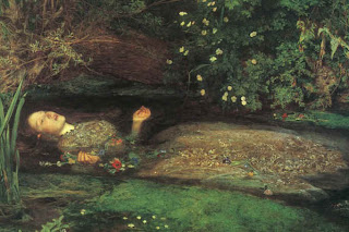
a futile attempt to juice him up by much talk of ‘veiled eroticism’ and ‘erotic longing’ in Ophelia and Mariana but it’s all a little too tame. Ophelia is a stunning image, memorable, but ultimately, a pretty and pretty unrealistic image. Mariana is over-produced with its stained glass windows and objects distracting from the subject – her pose. Nevertheless, this is one of the better paintings in the show. It could have been nicely paired with the later portrait of the woman in the chiffon dress. Both are back views where the subject’s gains erotic presence through what is not shown. It was interesting to read more on Millais affair and ultimate marriage to Ruskin’s wife, the divorce granted on the grounds of the non-consummation! Even for Ruskin this was taking aesthete behaviour a little too far.

Scotland
His Highlander image is too maudlin for words and suits the tendency for the Scots to romanticise their history perfectly. It’s an image that sums up Scotland, but not in the way they’d like. The disaster that was Culloden, the long suffering woman getting things sorted for her hapless warrior man. It’s a good picture for all the wrong reasons. I’ve visited the highlands many times in the winter and his Scottish landscapes are wonderful technically, capturing rivers in spate, snow, rough loch water, chilly woods and dew drenched gorse. But even here, his insertion of either peasants at work, or himself and his friends fishing, spoils the effect. In the end he never transcended his Victorian values and class.

Factory production
The Blind Girl is a hideous image as is the Eve of St Agnes, his oddball incident paintings, fire-fighter, North-West passage etc. His later work (apart from the Scottish landscapes) descends into factory production Victorian portraits that reflect nothing more than the vanity and commercial transactions that they were. In the end his legacy remains within
England, occasionally revived in Led Zeppelin album covers or movies like Picnic at hanging Rock.

Tuesday, November 06, 2007

The Crack and the Crackpot

Salcedo's crackpot ramblings
I’m writing this sitting right next to the giant crack in the turbine hall of the Tate Modern. Love the crack but not the artist’s ramblings. The programme was full of pointless rhetoric about colonial and post-colonial histories and memories but this was, basically, a crack. Her puerile rhetoric on separation is just hopeless as is the title 'Shiboleth' - sheer verbiage.

I'm surprised at the manufactured look of the crack. The fracture looks designed and not natural with lots of obviously designed angles. The wire mesh inside is also obviously not a statement but the guiding mesh for the subsequent excavation of the crack. There has been much speculation about its manufacture – to me it seemed obviously drilled out. You can see the concrete pattern traverse the crack showing that it has been dug out.

If you let the work speak for itself, it turns out to be something very good indeed. The crack snakes down the entire length of the hall eventually hitting a glass wall where it continues as a reflected image. The child’s game ‘don’t step on the crack’ floods back and it’s great to cross over, peer into and generally follow the thing to its end. At its widest its 8-9 inches but dips don to 2-3 feet at its deepest. It’s bold, disconcerting, worrying, edgy, and fun. As a work, it’s really a void, not a positive presence and the fact that it’s beneath your feet means that the reverence that surrounds work of art is impossible to maintain. You literally walk all over it.

I’ve never seen so many people photograph a work at one time. One guy even lined up small plastic soldiers at the crack’s edge to create his own work from the existing work. It draws its power from being a fracture on the floor a cleaved certainty (the ground we walk on). It just shouldn’t be there – but it is.

All of this raises an interesting aesthetic question. Can an artist accidentally create brilliant art? Does the intention of the artist always matter? Could the artist intend one thing but create another? Suppose you walked into the turbines hall and saw the crack. How many would get the colonial/post colonial link - few. It induces lots of reactions.

Siena – Art for a City (National Gallery)

Good to see an exhibition based on a city rather than the usual artist or vaguely populist theme like ‘Gods and heroes’. The relationship between art and a city is as explicit here as it is with, say Pop art and New York or Venice and Canaletto. Once visited Siena creates a permanent image in your mind – the Campo, the soft brown and ochre stone, the sheer audacity of such a space in the centre of a city. Ravished by the plague it never really gave Florence and Rome a run for their money, but it could have been different. Its art played a significant role in shaping the Renaissance. This was, in part, due to pride. Much of what we see here was commissioned by the local authorities, even the covers of the council accounts were works of art!

Their local heroes were a pope, a preacher a couple of saints and more than a few talented painters and sculptors. They even succeeded in securing a transfer for Donatello from the Florence team.

The early images of Saint Bernardino show that bouts of religious fervour gave such preachers huge celebrity fame. It was obvious from these few images in the first room that he was quite a performer, all passion, hand gestures and icons. Saint Catherine of Siena also features as a life size wooden statue in this first room.

Based on a formidable tradition of fine painting from Duccio, Lorenszetti and Martini, the second room has the huge altarpiece by Matteo di Giovanni (1428-1495). The Virgin features strongly here.but the quality of the works didn’t warrant the hype. In the next room we have the Donatello door panel – stands out as soon as you enter the room. In heroes and heroines we have the bizarre story of Griselda, who is publicly stripped and humiliated by her husband who forced her to prepare for his second wedding.

The panels showing Alexander and other heroes are the highlight and I found my attention dipping in the subsequent rooms, especially Beccafumi (1484-1551). Once again the annoying lack of space and seating makes such exhibitions an ordeal.