http://www.blogger.com/template-edit.g?blogID=27684744 ARTYFACTS: January 2007

Saturday, January 27, 2007

East West - Tate Britain

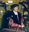
Not really an exhibition, more a scattering of unrelated objects in each of the main rooms of the permanent collection. It tries to show us how 'oriental' or 'muslim' art can be seen within the context of western art. However, apart from Turkish carpets appearing in paintings by Holbein and others and some fancy dress for aristocratic portraits, this remains a poor theme, sparsely illustrated.

Gone native!
The objects, carpet, korans, moasue lamp, vase, painting, pate and photograph were less interesting than the oriential paintings in Room 9 (I think). Here we have images that show what we were thinking about at the time. Wilkie's portrait of Mehamat Ali and John Frederick Lewis's paintings are the highlights. I did like Lewis's image of Edfu where he used the famous ruins as a low backdrop for the image of camels and locals. He spent years living in Cairo. Tellingly, even the picture note on the wall referred to him 'going native'. What's the Tate thinking about?

Here's a question. When was the frist English translation of the Koran?
1649 - a few months after Charles 1 got beheaded. The illustrated inside cover of the later Koran was fascinating in its complexity and detail.

Cymbeline - Lyric Hammersmith

Swanning about
On the way back to Brighton I bumped into Simon Fanshawe who told me about his brief time as a theatre critic. He had been sent to Stratford to see some Shakespeare and after the performance had gone to the Swan Hotel – an awful half-timbered lodging, where he was given one of their themed rooms – Malvolio as it happened, the maligned Puritan from Twelfth Night. Unhappy with the room, which was at the back, he went back to reception and asked t be moved to the front of the hotel. The receptionist was a little ‘peeved’ but gave him a new room. When he arrived it was Tatania, Queen of the Fairies!

Altercation
Anyhow, Cymbeline at the Lyric, Hammersmith. First the theatre. I really don’t like this place. The theatre bar is cold and listless and the theatre has a dark and depressing feel. This wasn’t helped by the idiot behind me who proceeded to snack, or should I say gorge, an entire picnic of sweets, fruit and sandwiches throughout the performance. I could take no more, turned and said ‘Give it a rest will you’. He replied ‘would you like one and offered me a sweet’!

Futile resurrection
Anyhow, Cymbeline. What does one make of a play that flits between two countries and includes a visit from the god Jupiter. The plot is as trite as one can imagine and no amount of programme notes, warbling on about childhood memories, can redeem a weak play, weakly resurrected in a modern guise. Knee high gave it their best shot, but talented storytellers as they are, base metal can’t be turned into dramatic gold. I did like the band. They were perched on a balcony stage a la Globe and the vocals were edgy. Interactions with the audience were good and this could have been the basis of something rather interesting, as a critique of Shakespeare’s poor plotting and odd storylines. In this sense, for all its toy cars, dossers and dangers, it was a strained effort.

One has to ask whether a play, which is deemed too old-fashioned and opaque to present in it’s original Shakespearian language, should be resurrected in modern prose. As the plot is hopelessly crude and complex, there seems little point.

26 January 2007

The Taming of the Shrew - Old Vic

The Taming of the Shrew – Old Vic
Loved Twelfth Night and after a freezing walk to the theatre it was great to sit down in beautiful warmth of the Old Vic and think – entertain me. Of course this play is not a modern favourite as it deals with the now dodgy subject of a man taming his shrill wife. Nevertheless, the audience seemed to be mostly women and they loved it.

Kiss my white ass
Turning Petruchio and his sidekick Grumio into cowboys was inspired. The chaps. G-strings and bare asses (only revealed on turning when they exit) was real theatre. A sort of ‘kiss my white ass’ joke. In fact all of the costumes were intriguing. I thought I spotted some pop influences - Michael Jackson, Jethro Tull? The music varied from soprano choral to rock, blues, swing and country & western. The GCSE kids in the audience loved all of this. The transformation into tramps was a bit odd, but this is my only negative comment on another great night watching this all male cast nail it yet again.

Learn to learn
An unexpected theme was learning. There’s loads of direct reference to learning in the text and it could be argued that it’s a study in how we change the behaviour of others, rather than the usual interpretations around marriage and gender. There are lots of references to learning, teaching, schools and lessons in the text.

The play presents different methods of learning by Lucentio, Hortensio and Petruchio. He covers booking study, tell and practice and learning by strict behavioural change. On the whole he has a clear distain for an over-scholarly approach to life and learning. Learning Latin is satitrised, the expense of University questioned and mnemonics praised. Learning from experience is his recommendation.

The play starts with a goal:
Here let us breathe and haply institute
A course of learning and ingenious studies.

A balanced approach is recommended:
Let's be no stoics nor no stocks, I pray;
Or so devote to Aristotle's cheques
As Ovid be an outcast quite abjured:
Balk logic with acquaintance that you have
And practise rhetoric in your common talk;
Music and poesy use to quicken you;
The mathematics and the metaphysics,
Fall to them as you find your stomach serves you;
No profit grows where is no pleasure ta'en:
In brief, sir, study what you most affect.

On books:
My books and instruments shall be my company,
On them to took and practise by myself.

On learning:
O this learning, what a thing it is! O this woodcock, what an ass it is!

On scheduled learning:
I am no breeching scholar in the schools;
I'll not be tied to hours nor 'pointed times,
But learn my lessons as I please myself.
And, to cut off all strife, here sit we down:
Take you your instrument, play you the whiles;
His lecture will be done ere you have tuned.

On learning Latin:
'Hic ibat,' as I told you before, 'Simois,' I am
Lucentio, 'hic est,' son unto Vincentio of Pisa,
'Sigeia tellus,' disguised thus to get your love;
'Hic steterat,' and that Lucentio that comes
a-wooing, 'Priami,' is my man Tranio, 'regia,'
bearing my port, 'celsa senis,' that we might
beguile the old pantaloon.

On learning from a manual:
Madam, before you touch the instrument,
To learn the order of my fingering,
I must begin with rudiments of art;
To teach you gamut in a briefer sort,
More pleasant, pithy and effectual,
Than hath been taught by any of my trade:
And there it is in writing, fairly drawn.

On University:
while I play the good
husband at home, my son and my servant spend all at
the university.

Wednesday 24 January 2007

State Britain - Tate Britain

One kiloemetre rule
The day after seeing this work, I bumped into our local Labour MP David Lepper on the train and told him I had seen him mentioned in an art installation at the Tate. His name was on a list of MPs who had voted against the war on Iraq. The installation was Mark Wallinger’s State Britain, a messy line of banners, posters and paraphernalia of protest. Parliament passed a rather strange law banning protest within one kilometre of parliament. This was weirdly directed at Brian Haws who had been camping out there since 2001. Interestingly, the Tate Britain happens to transverse this one kilometre radius.

We’re guilty What did I make of it? As a thing-in-itself it is messy and brutal. The photographs of dead babies are sad and depressing. The sloganeering was standard stuff but I liked the BLIAR word and the Banksy graffiti! But in-itself it’s really a poke in the eye for the people, including myself, who go to see it. We’ll gladly travel to the Tate, but most of us walked on by, without paying much attention, when he was out there fighting for his right to protest. At this level it’s accusatory and we’re guilty.

All context no content? Wallinger is famous for his supposed exploration of boundaries and, on reading the one kilometre rule, there’s cleverness in the idea, but cleverness isn’t enough. It’s almost as if the objects themselves are irrelevant. The work is really an act, the act of moving it from one place to another, but it’s not particularly brave or exciting act. He has access to the art world, has an idea, and hey presto it’s in the Tate. Imagine for a moment the originator of the work, Haws, phoning the Tate with the same idea – they’d have hung up. At this next level it’s all context, no content.

Art and boundaries
OK let me come at this again. It’s possible to see the work as exploring the boundaries of art itself. Neo-Wittgensteinian aesthetics plays to the idea that art has fuzzy boundaries and that works are related by family resemblance and that art is an open enterprise that escapes capture and closure. Like Wittgenstein’s fly in the bottle analogy, referring to the boundaries of language and thought (the fly bounces off the walls but has no idea what lies beyond) it explores this conceptual boundary.

This reduces, ultimately, into an exploratory exercise in aesthetics unless one accepts that our perceptions of art have to be changed. This is the line taken by Carey in What Good is the arts? Anything can be art. If that is so there may be no boundary. The art establishment may be setting their own limited boundaries (the institutional theory of art). The problem with any institutional theory is that it doesn’t really answer the question What is art? It simply says IT is defined by experts. It’s a circular definition.

So do artists like Wallinger advance the arguments? If the point of art merely becomes escaping capture and closure, then this is also self-referential. It becomes an exercise in dialectically avoiding the obvious and places less and less emphasis on the art object and more on the process of evasion. This is just cleverness taken to a new level.

Another interpretation is to see it in the light of interrogative theories of aesthetics, where the purpose is to engage the viewer rationally and emotionally, even physically in the art object. Here we have a theory which fits Wallinger’s strategy. The above discussion was induced by the work and what I have gained are reflections and insights that have come from this catalyst. I think I have.

Timid act?
One last point. I can’t help feeling that art would be better served if it had been set up outside within the one kilometre limit as an official act of protest. Or if the Tate were more explicit about whether it is within the one kilometre limit. It’s a very timid act to put it into an establishment context like a national gallery.

Saturday, January 20, 2007

Around the world in 2 hours - British Museum

Around the world in two hours
Wasn't expecting much from this as British Museum shows are often claustrophobic and disappointing. This was different. 100 stunning aeriel photographs showing many of the worlds archaeological sights. Aesthetically they are beautifully shot in early morning light at an ideal angle to produce enough of a 3D effect, while retaining the bird's-eye view of the whole site. It's also the breadth of Gersters travels that impresses. It's a sort of 'Around the world in two hours' experience.

Additional perspectives
The photographs add things you don't get on the ground or from ground-level photography. There's the 'big picture', the architectural idea as imagined in the mind(s) of the architects and builders of these monuments. It's like seeing the blueprint come to life. Then there's the site's relationship to the landscape - it's shape and geology. Sites and civilisations have depended on the quality of the local rock for their posterity. Those civilisations that didn't live in stone-rich environments and built largely from mud brick or natural materials get less billing than those who did. The Egyptians lived in a rock-rich environment with lots of mineral wealth. They had soft limestone in the Valley of the Kings, sandstone for many of the pyramids and granite and hard rocks for statues and political stability for 3500 years. You also see the roofs and things that lie beyond the site.

A good example is the Ramasseum in Egypt, the first image at the door of the exhibition. I visited this just a few weeks ago and it is very impressive. It was here that Belzoni dragged the famous Rameses II bust to the banks of the Nile and back to the British Museum where it still stands no more than 30 yards from this image. It was the inspiration for Shelley's poem Ozymandias and is a great place to wander around in, usually free from the crowds who prefer the Valley of the Kings and other more intact temples: "My name is OZYMANDIAS, King of Kings. Look on my works ye Mighty, and despair! No thing beside remains. Round the decay Of that Colossal Wreck, boundless and bare, the lone and level sands stretch far away. " The photograph shows the full vision and the scale of the site beyond the temple. (I'd also recommend the £32 balloon trip at dawn across this site - you can try your own aerial archaeology.)

Fine catalogue
The catalogue is worth £25 as it contains all of this and more, as well as a fascinating history of aeriel archaeology from Crawford onwards. Did you know that in addition to balloons and aircraft, kites and even pigeons have been used to take photographs from the air? Made me desperately wantto visit Syria and Iran, which both seemed to be full of wonderfully interesting and intact sites.

20 January 2007

Thursday, January 18, 2007

The Last King of Scotland

Too black and white?
Like Apocalypto, there’s a whole debate about history, fiction and film on this one. It’s actually based on a novel and therefore doesn’t pretend to be real, on the other hand the opening credits do make claims about being based on real life characters and events – so we’re left hanging.

On the surface I enjoyed the film but, as is sometimes the case, on reflection deeper concerns surfaced. What had I really just witnessed, a realistic and probing attempt to uncover the problems that plague Africa, or another white good, black bad movie?

On the whole the balance of British Government interference, genuine people in the field and genuine Ugandans, helpless in the face of a series of dictators, is sensitively (if that's the right word) handled. But at times it's all too black and white. More than a few serious film critics have already pointed out that the movie follows the old formula of black Africa seen through white eyes, in this case a young Scottish doctor (at least it makes a change from snotty wife swapping English colonials), although they managed to sneak this in through the cliched cut-glass, accented beauty. Her 'I told you so' role was all to brief and odd.

This focus on Garrigan took some energy away from Amin and we never erally get to the bottom of his character. The big question is 'Why do these guys rise to the top and why do they turn into monsters?'. There are one-too-many, half-naked black women cavorting about, playing up to white view of African liscentiousness. A little more of Amin's past could also have been revealed We leave the film none the wiser about causes, only satisfied that Garrigan managed to eascape, and the Entebbe plot device was unimaginative.

A black watch
I also felt that it didn’t play the comic/tragic card nearly as well as it could have. I was also surprised to see the clichéd Scottish living room scene at the start with its Dr Kildare room and sherry at the dinner table. More could have been made about the Scotland connection. Scotland's military history is full of incidents that illuminate the colonial past and The Black Watch is surely a phrase that could have sneaked into the script.

Hope Forest Whitaker wins the Oscar. He was mesmerising as Amin and played the paranoid, hurt, calculating child-monster to perfection.

Apocalypto

First serious film of the year and what a start. No English, very little dialogue but it never slows or stutters in its relentless pursuit of its genocidal theme. It is relentlessly violent but that’s the point. Genocide and Aztec sacrifice were not pretty. From the opening hunt scene you are drawn into the world of the jungle and actually feel agrophobic when the temple town is reached. Stunning.


History is junk
The history is all a bit out of synch mixing Aztecs with Mayans and the final landing of the Spaniards could be open to criticism. The film was shot in Mexico using the Mayan dialect, yet the violence is really Aztec. This is a shame, as it would have been easy to fix this at script stage. The Mayans, however, were not without their violent streak. I can vividly remember visiting the sacred pool at Chichenitsa and reading about the hundreds of bones dredged from the bottom – the bones of young sacrificed girls. The firm is magnificent.

11th January

Museum Night

Can't we have silent cinema food?
Fun with the kids although the sound of fat people eating popcorn was frightening. Who in their right mind thought, and still think, that popcorn and movies complement each other. And why sell sweets in wrappers that rustle like crazy when you open them? And while I'm on the subject - stop selling straws - people slurp at the end of the drink! Here's a plea for silent cinema food.


Odd history, great graphics

The American Museum of Natural History in the US is a rather strange place with its themes and odd displays. (However, I love the meteorite room.) This is reflected in the movie which seems to deal mostly with US History and not Natural History. We have cowboys teaming up with Romans (conveniently sidestepping coboys v indians), drawing obvious parallels for those of a geopolitical bent, and Ghengis Khan, cavemen and oddly, Roosevelt, all fighting for truth, justice and reconciliation. The Egyptian code idea is stupid but so is the whole idea - it's just some fun. What is good are the graphics. The lions, dinosaurs and god knows what else are seamlessly integrated.

The Caucasian Chalk Circle

Brecht in Berlin
I had seen The Rise and Fall of the City of Mahogany in Berlin late last year, unfortunately in German, making it merely a spectacle, rather than something I could get my teeth into. The dancing and music were great, the dialogue incomprehensible. However, it was my first visit to the famous Komische Oper, quite a theatre.

Brecht in Brighton
Brecht is not always to my liking and I wonder if this play would be staged at all if it were not for A-level drama students. A large proportion of the audience were in groups from schools and colleges. This is to be applauded but one wonders if it is the demands of the curriculum that keeps ceratin plays being staged, rather than their intrinsic worth or non-studying audience demand. In any case, they all seemed to love it. I had my doubts.

The singer walked on and looked like a camp cross between of Alex Kapranos and Ian Curtis. However, his singing and Ivor Cutler-like organ playing was excellent. You couldn't keep your eyes off him. The plot suffers from being under the sway of dialectics and swings and lurches forward to it's conclusion where the final dialectical move with the baby in the circle takes place. We all felt a little twinge of guilt as the noose appeared - the executions of Sadaam and his henchmen had been in the last week.

Stiletto in my heart
I was fascinated to read in the programme that Brecht was buried with a stiletto in his heart and in a steel coffin, so that he wouldn't be eaten by worms!

17 January - Corn Exchange Brighton

Twelfth Night - Twin pleasures

Two titles
I didn’t know what to make of the only Shakespeare play with two titles (Twelfth Night or As You Will). It wasn’t until it was over that it made sense. The play is all pairs, twins, crosses, collisions, reversals and double entendres. This was an all male production so we had a male actor playing a woman who is in love with a male actor playing a woman pretending to be a man who he confuses with another male actor paying the aforesaid woman’s twin brother. As You Will

As You Will addresses me the viewer. It has another meaning as the word ‘will’, has some sexual potency in Shakespeare. But it also his name and this play, I think, is much more deeply personal that is normally imagined.


Twins
I am the father of twins but only discovered that Shakespeare had a twin boy and girl, Hamnet and Judith, in the programme, minutes before the performance started. I was disorientated by this and totally shaken when I further read that the boy, Hamnet, died, probably from the plague, when he was only 11 in 1596, four to five years prior to the writing of this play.

It’s hard to explain the relationship between twins unless you’ve caught glimpses of their invisible psychological safety ropes. It reveals itself in the most bittersweet way when one gets ill, is bullied at school, gets lost in the street or is separated for the first time. They feel injustice, pain and loss in a special way. The involuntary tenderness they have for each other is often just glimpsed in the emotion turmoil or trauma.

What it must have been like when Hamnet died is beyond my imagination. The grief of the surviving twin must have be unbelievably intense, compounded in the parents, who on top of their loss must have felt pain for the remaining child. This extreme trauma must have effected his writing, something I was about to experience.

There is the obvious similarity with the name Hamlet and in Joyce’s ‘Ulysses’ Stephen Daedalus states that Hamlet is, in fact Hamnet,

“Is it possible that that player Shakespeare, a ghost by absence, and in the vesture of buried Denmark, a ghost by death, speaking his own words to his own son's name (had Hamnet Shakespeare lived he would have been prince Hamlet's twin) is it possible, I want to know, or probable that he did not draw or foresee the logical conclusion of those premises: you are the dispossessed son: I am the murdered father: your mother is the guilty queen. Ann Shakespeare, born Hathaway?…. Hamlet, the black prince, is Hamnet Shakespeare.”

Perhaps, but it is clear that Sebastian and Viola are written with parental love, and must surely be, to a degree, Hamnet and Judith. Judith

The opening scene deals with the loss of a brother:

A brother's dead love, which she would keep fresh

And lasting in her sad remembrance.

In scene 2 Viola finds herself in a strange country having lost her twin brother, who is now in heaven:

“My brother he is in Elysium.”

The play was first performed at Middle Temple Hall, London during the Twelfth Night celebrations of 1602 at the culmination of the celebrations, which was then at Candelmas, February 2. Hamnet and Judith Shakespeare were baptised on February 2nd 1585 and although we don’t know the date of their birth, the 6th January (Twelfth Night) is possible.

Far from being a simple, and crude, plot boiler, the ‘twin’ theme must have been so close to Shakespeare that it hurt. Although written as a comedy this play goes beyond simple comedy into other more frightening and tragic territory. Twins, for Shakespeare, personally embody extreme joy and extreme tragedy. This play is a monument to this personal joy combined with the emotional abyss of a child’s needless death. In it he reunites his twins who have both found love and joy in life. It is, perhaps, a therapeutic exercise.

Filthy Shakespeare
The audience had a large number of young people, some clearly from schools but others as couples. This was pleasing. Not everyone in Generation X is chugging back alcohol or addicted to the Xbox.

I have just finished Filthy Shakespeare by Pauline Kiernan and was amazed at how easy it is to miss the sheer pronographics nature of the material.

This performance had Maria thrust Sir Andrew’s hand into her crotch in the following exchange:

SIR ANDREW

Marry, but you shall have; and here's my hand.

MARIA

Now, sir, 'thought is free:' I pray you, bring your hand to the buttery-bar and let it drink.

Malvolio, the play’s puritan boor, is duped into spelling out the word CUNT on stage, an awkward moment for teachers and GSCE pupils in the audience.

MALVOLIO

By my life, this is my lady's hand these be her very C's, her U's and her T's and thus makes she her great P's. It is, in contempt of question, her hand.

The play’s full of drunkenness, lechery and trickery.

Duped
The play ends with an astonishingly cruel and bitter scene as the isolated and abused Malvolio promises revenge on all of us – and he means the players and audience. Molvolio has been the butt of or jokes and in this performance his butt literally hangs out over the top of his yellow breeches but he fights back. We’ve laughed and wondered at the tale but we’re left rather stunned by his promise of revenge. What have we done. This is a promise that comes from nowhere, full of venom and bite. It literally stuns the audience into silence. Life is full of promises, illusion and reversals of fortune, but in the end our entertainment is always at someone else’s expense. Malvolio has the last word, as did the Puritans when they closed the theatres in 1642. What an exhilarating night.

9 January Old Vic London

Sunday, January 14, 2007

Holbein - National Gallery

Henry VIII - fat thug
Focuses on his two periods in England. The English love the Henry VIII (and his unfortunate wives) story, despite the fact that he was a fat, psychopathic thug. The full length portrait from Madrid reminded me of a football thug or one of those fat English guys on holiday in Spain, posing for the camera after an all-day breakfast and five pints at lunchtime. This image IS Henry VIII. It has fossilised him in history. Art is that powerful.

All in all I was really looking forward to this show, but left a little downhearted. Holbein is a surface portrait painter. His realism had to flatter as his commissioners were dangerous. There are no 'inner thoughts' here, only the outside - it's all skin and fabric, or even worse in the case of henry - propoganda.

Did Holbein use optical Devices?
I really wanted to see, especially from the drawings, whether Holbein had used, as Hockney claims, optical devices. It is clear that he did. The drawings show exact tracings of heads with roughly sketched clothes and the dimensins of the portraits are remarkable similar. In his portrait of Thomas More's Son, the face is precise and the clothes really do seem to have been traced.

The Ambassadors (1533)
I popped into the National Gallery to see The Ambassadors, as it couldn't be moved for this exhibition. Hockney claims that the abundance of almost perfectly bdrawn rounded, and foreshortened objects in this painting could not have been drawn from life, especially the lute on the bottom shelf. The globe with its perfect map, the book with its musical score, all seem too perfect to have been eyeballed. The two books in the foreground have differnt vanishing points. Then there's the skull, as clear a clue as one can get that he was using such devices.

Portrait of Georg Gisze (1532)
I saw this in berlin a month later and it is even more convincing on the Hockney hypothesis. The walls are not at a right angle and the table slopes off dramatically in the bottom right hand corner. where we have a completely different perspective. The scales are not balanced.

Vermeer - Mauritshuis in the Hague

Mauritshuis
The Mauritshuis is an outstanding gallery. A calm town house with some of the greatest paintings in the world, notably Vermeers and Rembrandts. I like these townhouse galleries like the Soames and Wallace collections in London. maybe it's the human scale and context.

Vermeer
There are only three Vermeer's here but two are masterpeices.

Gi
rl with a Pearl Earring
His famou
s yellow blue and white palette works to perfection here, against a dark background. She turns, she parts her lips and she gazes into your eyes. The pearl hangs there, a sign of chastity, but this painting seems far from chaste.

View of Delft

This could
be the greatest painting of a townscape in existence. Every level in this painting works, the triangle of orange sand, the river, the boats, the walls, the foreground buildings and the Neuwe Church lit by the sun (political point) in the background and a cloudy but sunny sky.

Rembrandt
My favourite five were:
Portrait of an elderly man - real inner thoughts revealed - he's bored and wants to get back to the tavern
The laughing man
Self-portrait - brushwork remarkably loose - an honest painting
The anatomy lesson of Dr Nicolaes Tulp - strange group- no one is listening - neither were the group of tourists when the guide was revealing its secrets
'Tronie' of a man with a feathered beret - fun

Dutch nazis
After the gallery we went for a beer in the square outside and witnessed the police chasing, what turned out to be an unusual crowd, of chanting hoodlums. They were Dutch nazis - all skinheads and doc martins. In any case they settled down for a civilised beer after a few minutes - they were Dutch after all.

Friday, January 12, 2007

Velasquez - National Gallery

In Seville
The exhibition opens with some early, sometimes poorly composed, but remarkable paintings. I was used to seeing An Old Woman Cooking Eggs, as it's from Edinburgh, but The Water Seller is superior in terms of painted textures; the slips on clay pots, stains and water drips. I rather disliked the two Kitchen Scenes with Christ. They're very staged and the view through the hatch is an artifice. The nun, Jeronima de la Fuente, she rocks, with her cricifixion as a weapon and ribbon a trajectory of bile - he could spot the power of the fanatic. The religious paintings The Immaculate Conception, St John and St Thomas have no life to them. The rest is all Murillo-like and too devotional.

Christ, Appollo and the weird figure of Don Gaspar
Christ after the Flagellation is horrifying, with its cruel shaft of light, but the Apollo at the Forge of Vulcan is the finest work in the room with the startled apprentice. I then spent some time pondering on the Don Gaspar de Guzman. His head is tiny and his right arm is hopelessly elongated. It was much later that I read Hockney's theory in Secret Knowledge, that Velasquez had used an optical device, and that this distortion was the result of the necessary realignment of the device, as he moved down the body. Hockney must surely be right. It is hopelessly ill-proportioned.

Court of ugliness
If Velasquez had not been forced to earn a living through the patronage of Philip IV we would have been spared the posed ugliness of his royal subjects. Who could fail to peer first, close to the canvas, then far back, to wonder at how someone can apply such crude close-up strokes to produce such subtle effects, only seen at a distance. However, nothing can hide the ugly posing of this house in decline. His royal portraits are not his best work. The saving grace are the images that do not contain royal blood.

In Prince Batasar Carlos with Dwarf we see an ugly dead-eyed child with his lively dwarf companion. Prince Batasar Carlos in the riding school and on Horseback are simply dull. The horseback image simply does not work. The head is still in the studio and the horse balloons out of proportion into a podgy mess. Even the landscape is odd. Philips IV in Brown and Silver is ugly, stilted and commands no sense of majesty and Philips IV hunting Wild Boar is lifeless and diffuse. I have never seen a monarch so ugly and ungainly. Velasquez literally feels bored in these paintings.

The room is redeemed, however by the dwarf Francisco Lezcano, where the paint says 'don't judge me, we're both slaves to his whims'. This is a masterpiece.

Priests and ugly girls
Pope Innocent X is justifiably praised. You can look into his scheming eyes for hours. Similarly with the Archbishop Fernando de Valdes. They're of the prisethood but painted like mafiosi. Camillo Massimo, unlike the King and his family, seems totally in control, confident and politically astute. As for the Infanta Margarita in a Blue Dress and Queen Maraiana - grumpy, trapped and overblown. The Infanta Maria Teresa's dress looks like a tent.

Venus and Mars
Only four paintings in this last room but two make the other two almost invisible. First The Toilet of Venus, measured, erotic and very much a real woman, not a god, with the diffuse image in the mirror. She has the most exciting figure. Then my favourite picture - the astounding Mars - almost a comic image with his funny hat and sicarded weapons. His face is of an old soldier not a god and his body weary and aging. A very, very starnge picture.

Carravagio & Rembrandt - Amsterdam

One of the wonders of low cost air travel is the ability to pop over to see an exhibition or two in another country. Five of us, Gil, I, Jackie, Miguel and Ken took the opportunity to visit the Carravagio/Rembrandt show in Amsterdam and the Mauritshuis in the Hague. Great few days.

Carravagio Rembrandt - a comparison
The Van Gogh Museum has this great encounter between the two geniuses of 17th century Baroque painting: Rembrandt and Caravaggio. This was the 400th anniversary of Rembrandt's birth and what better present than his 'chiaroscuro' mate Carravagio. In these two north and south unite, and although they never met.they are the two masters of the Baroque. Galleries tend to group paintings by geography so you never see comparative displays, yet these two belong next to each other more than they do their contemporaries.

What was more interesting to spot were the differences. Carravagio is never a portrait painter even when painting protraits and his figures are much more 3D, much fuller. He is also, usually, far more dramatic in composition.

Game on
Let's play it straight and see who wins the comparative game. I'll choose a win or draw for each pair.

The Rape of Ganymede
Omnio vincent Amor
Both break with tradition, but sorry but Caravagio wins hands down this one with his outrageously, homoerotic, rentboy image that looks as though it belongs to some sordid and illegal internet site. Framed in a gallery it looks so innocent but it ain't. It's a young boy thrusting his cock at you the viewer. And look at his face!

A schoolboy at his desk
A boy bitten by a lizard
Again, it's Carravagio. There's so much more going on. Nature bites back and the sphere's herald the end of Renaissance religious domination - science is in the air.

Portrait of Wten Bogaert
Portrait of Martelli
It's a draw on this one. Here the Reformation meets Catholicism. Who would you rather be the Maltese Knight or mthe merchant? The Martelli painting is a good example of a painting that looks so compeltely different when seen for real. The cross on his tunic is nothing more than some broad brush strokes to give the impression of silk, yet in reproduction looks much more carefully painted

Belsharrar's Feast
The Supper at Emmaus
Carravagio for me. Belsharrar is too melodramatic.

The Jewish Bride
Conversion of Magdalen
Carravagio has caught everyone in the spell of the moment but Rembrandt wins. The relationship between father and daughter is touching. Carravagio's is having to rely on symbolism.

The Blinding of Samson
Judith and Holofernes
Carravagio wins again. Rembrant paints intent, Carravagio action. Never scared of showing blood on his knives, Carravagio paints the gore and the painting is in close-up. It fills the entire frame so there is absolutely no intention of hiding anything.

Bathsheba Bathing
St Jerome Writing
A late goal by Rembrandt. The casual, realistic nude beats the saintly pose. This rather arbitrary comparison between a nude woman and saint doesn't really work.

The Holy Family
The Holy Family
A Carravagio win. Same subject but carravagio makes Jesus the lead and Mary looks you the viewer in the eye. Rembrandt has a more tarditional, family composition, although Mary's breasts seem to dominate the image.

Abraham's Sacrafice
Abraham's Sacrafice
Rembrandt win. The exposed throat and falling knife show more. Although I like the way Carravagio's angel is off camera, as angels should be.

The denial of St peter
The betrayal of Christ
Carravagio wins. His composition and depiction of betrayal is much stronger.

Flora
Boy with basket of fruit
Carravagio gives us two paintings in one, the boy and the fruit basket. He was a great still life painter and the boy's flshy come-on, with his shirt down over his shoulder is beautifully contrasted with fleshy fruit - some decaying, of course.

Flora

The penitent Magdalen
An injury time goal by Rembrandt. Carravagio prefers the dynamic of a group whereas Rembrandt is bettter at solitary inner thoughts.

I may be a northern calvinist but it was always going to be carravagio!

Carravagio - National Gallery

Carravaggio: The Final Years
Caravaggio (1571 - 1610) has become a popstar in Art. Drink, murders, duels an early death and masterpieces that only seem more astonishing as time goes by and this show is a finale - his final violent and tortured years.

The Supper at Emmaus (1601)
St Francis in Meditation (1606)
The Flaggelation (1607)
The Crucifixion of St Andrew (1606)
Knight of malta (Martelli?) (1607)
Sleeping Cupid (1608)
The Raising of Lazarus (1608)
The Adoration of the Shepherds (1609)
The Anunciation (1608)
St John the Baptist (1610)
Salome with head (1606)
Salome with head (1607)
The Denial of St peter (1610)
The Martyrdom of St Ursula (1610)
David with head of Goliath (1610)

Almost all of these paintings were completed after he had a price on his head for a murder he had committed in Rome. He was basically on the run. This was the theme explored by Simon Schama in his book and TV programme and a turning point in art as religion was abandoned in favour of more secular imagery.

Having searched out every Carravagio I could find in whatever city, church or museum I wasn't about to miss this. It is Rome that contains the most substantial selection of his work, although one has to work hard to see them all.

Just sheer genius.

Hockney - National Portrait Gallery

Schizophrenic
This was a schizophrenic experience. Hockney's explicit homosexuality, urbanity and LA sunshine still startles a conservative Britain and picture in these areas remain his best work. I also like the intimate images of his mother and father. My Parents is touching. Mr and mrs Clark with Percy is just fine.

However, the photography and later portraits fail to deliver. The curator drawings are of real interest as part of his quest for exposing the use of optical devices in art, but in themselves of no artistic interest. I have to say that this book fascinated me and I went back to the National Gallery to checlk out his theories about Holbein, Campin, van Eyck, Carravagio, Velasquez, honthorst, Rambrandt, Ingres, and Vermeer. His arguments are very convincing.

From early 15th century many Western artists used optics. Is this cheating - not so says Hockney. The artist still makes the mark and drawing is still as difficult.

Visual clues include:
  1. precise and accurate drawing, not eyeballed and groped for
  2. differences in scale as optical device is moved and magnification changes
  3. patterns on folded material follow folds precisely
  4. photographic lighting with strong shadows
  5. optical devices (lenses) start to appear in paintings
  6. changes in focus
  7. foreground objects and effects very large
  8. lens artefacts - halo effects
  9. effects not seen with naked eye
  10. patterns go out of focus at back
  11. differences in perspective as optical device is moved and magnification changes
  12. collage construction - few overlaps - separate images on one canvas
  13. thirty centimetre rule for mirror projection - the sweet spot
  14. popularity of still lifes
  15. left-hand3ed drinkers etc.
  16. closeness of figures to picture plane
  17. white table cloths to allow refocussing
  18. undermarks to establish shapes
  19. captured expressions (Hals)
  20. distortion
  21. connections between artists and scientists (especially Vermeer)
Some examples are:

The Abassadors - Holbein. We have the distorted skulls and amazing detail on cabinet.

Merchant in Berlin - Holbein
I was to see this Holbein image in berln some months later. It is astonishing to see the obvious error in real life. the bottom right hand corner literally fal;ls away in an attempt to get the pot of money seen ( at a different perspective).

Arnolfini Wedding
Convex mirror and chandelier seen front on and not from below as expected.

Carravagio's Bacchus
close to picture frame, left handed

Frans hals - feather in cap
impossib;e capture of expression

Velasquez -Don Gusten
result of moving limited range device

Frans Hals - long man
result of moving limited range device

Genovese lady - van Dyke
result of moving limited range device

Kandinsky - Tate Modern

Kandinsky anyone?
Has anyone, ever, been so obsessed with color? Kandisnsky's onbsession became arcane and odd but he sliced colour across the canvas and shaped (and coloured) all that we now see in abstract art.

I haven't seen many Kandisnky reproduced images on people's walls, apart from the grid of targets, popularised by Ikea no less, and why not. Is this because almost every ther image is fractured, tortured and jarring?

Impressions, improvisations and compositions
I lost the plot when it came to impressions, improvisations and compositions. Then again, so did K. He was always trying to template theory on to art, but rarely with any success. It reeks of Platonic forms, denyies representation but doesn't replace it with enough to want to look for very long. It's fractured. Diagonals disturb me.

60 Years of British Art - Hayward

Rare chat in gallery!
Had an interesting chat with some real people in the gallery - that's very rare in UK art galleries, where all is very reverential. While watching a 9 minute video by Gilbert and George (a bit of a trial) a couple of women passed in front of me, clearly dismissive of the posing pair and the very idea of watching them for any longer than a few seconds. I told them I'd persevere with the video and give them an opinion at the end. They did indeed ask my opinion - I thought they reeked of art school posturing, or those undergraduates that think they're Noel Coward for a couple of years, fops, faux peopledressing in tweed suits - all so very English. I'm not of that culture and found it fucking annoying. We then engaged in a long discussion about our likes and dislikes, joined by another man they seemed to know. We discussed some weird terms such as 'copper sulphate ' and 'potassium permangenate' - terms we hadn't heard since school (there's a Roger Hiorns engine caked in copper sulphate in the exhibition). People should talk more in exhibitions. there should be greeters, formal introductions and curator-led discussions all day and every day.

60 years
The Hayward promised to give me a fill of post-war British art. It did, but did it disappoint? If this were 60 years of US art I'm sure I'd have come away surprised and exhilarated, wit a ocnstant flow of colour and innovation. But Britain stuttered through the last 60 years, and I came away with a sort of shrug of the shoulders. It reeked of art school, shabby studios and dungarees.

Bridget Riley smacked of computer-generated art, Barbara Hepworth of sixties coffee tables, Hiller of amateur movies, Hirst of overexposure. I did like the Lucas self-portraits, especioally the one with the fired eggs and the one great piece - Bacon's screamoing Pope, incidentally one of the oldest - 1949.

Albers & Moholy-Nagy - Tate Modern

2D v 3D
Having seen the Modernism exhibition at teh V&A this was like going from wide-screen to close-up. Albers and Nagy taught at the Bauhaus and this exhibition is mostly 2D. I say this because the driver behind their art - the new mechanical world, was throoughly 3D. This gap was way too wide at times. Their grids, stained glass and etchings seems stuck in the 2D past. Flat planes are all too plain. I much preferred the 3D designs of cars and engines at the V&A.

It's the art of the drawing board and setsquare. They ask you take time in front of each image but the flatness is as dead as a polished gravestone. Most of it doesn't come to life. Things improved enormously wehn we saw print work for the London Underground and Imperial Airways. Quite apart from the historical interest (Paris £4 15 s, Cairo £75 return, Jo'burg £225 - 8.5 days, Singapore £280). It took 12 days o get to Brisbane!

Rembrandt - National Gallery

Modernism - V&A

Reflections on Modernism
Lovely spacious exhibition in the V&A with plenty of room to walk, view, read and reflect. Many curators forget about reflection, yet this is the most rewarding part of an exhibition. Reflection demands space, lighting and sometimes a place to sit. It pisses me off when curators refuse to put seats in large spaces and treat their paying audiences like sheep that have to be herded and pulsed through the experience. Is there any theory of aesthetics that says one should not spend time looking at things? Do we not pay to be stimulated into reflection?

The Chechoslovakian car, a Tatra T87, made in Czechokslovakia in 1938 (the first real production model in Europe) was beautiful with its wings and three headlights and the Frankfurt kitchen, designed to minimise walking between tasks, with every step analysed, was novel. This was a BIG show and delivered much if one had hours to spend reading, comparing and reflecting. It also had breadth - eveything from buildings, interiors, household objects, cars, print, posters, clothes - the lot.

Modernism 1914-1939
The show revealed the extent to which the Russian Revolution, and new socialist ideas, drove modernism in the 'between the wars' period. This was the force for change. The past had to be eradicated. It led to the utility of image and design. Fordism and Taylorism worshipped indutry and technology in much the same way. Curious that modernism transcended its political roots to become part of everyone's world view, espite its utopian roots.

Machines and mass production
Art is still getting to grips with the idea of masss production fighting, sometimes desperate, rearguard actions against the idea that massive and popular creation and distribution is a good thing. Scarcity and rarity are still admired.

Technophobes at heart
We live in an age where many artists are technophobes, yet Modernism celebrated technology with verve. Seeing a nine cylinder aircraft engine presented in the V&A was amusing as most of the people paying to see it wouldn't dream of popping into the free Science Museum next door to see the same exhibit. At times this conceit is all too obvious - technology is worthy of artistic treatament but I won't use it. Artists often eschew technology in their own hoems and lives. As it turned out art was helpless as painting, sculpture, stage and print were undermined by in technology driven media such as photography, film, television and now digital media.

Britain's watered down modernism
What struck me on leaving, and sitting in the train coming back to Brighton, is how relatively untouched Britain was by continental modernism. Our residential architecture remained revivalist as we developed no real taste for hiring architects. We had a pared back version of modernism. We reduced it all to chairs! Oh how we loved, and still love, modernist chairs. The Brighton Museum is full of them! Later we would hide our traditional interiors by pannelling our doors and stripping out Victorian features but few would ever actually build or live in a modernist house. Except, of course, those who didn't have a choice and were caged up in high flats. Britain has never done tall buldings well.

Technology eats itself
Modernism's fate? Ultimately technology ate itself. Computerisation, minituarisation and design made the mechanics of technology invisible. It was all small and hidden. The iPOD does away with the mecahnics and presents a smooth, simple, slick surface. What modernism once celebrated was ultimately invisible.

Rodin - Royal Academy

We visited the Rodin's studio in Paris 30 years ago, and I can still remember being taken aback by the erotic, if not pornographic, nature of some of the work.

The Gates of Hell
These greet you in the courtyard but seeing the huge bronze doors on their own, isolated in the cold outside air diminished their impact. the figures climb, hang on, dive out and struggle to keep grip and it's a door one will never have seen anywhere else. But a door is an entrance to somewhere else and this is where the peice fails and becomes a huge rectangular structure. They never did adorn the proposed Museum of Decorative Arts.

Rodin and Britain
One of the themes is Rodin in Britain, but judging by the exhibits of those flouncy aristocrats who commissioned busts of themselves in pretty little poses, this didn't seem to do him much good. I'd have much rather seen him deliver images of these pampered celebrities in pornographic poses, legs akimbo - now that would have impressed!

The Thinker, The Kiss, Victor Hugo, Burghers of Calias and Balzac
These are the five iconic pieces and they're knock-out. Having been to Florence in the past year Michelangelo and Donatello are there in the room but Rodin throws idealised poses to one side to give us broken noses, huge hands and feet and in Balzac's case an almost Elephant Man's physique.

Ancient Persia - Birtish Museum

Huge Empire sqeezed into cloakroom
What a disappointment. Having read Tom Holland's Persian Fire and had a lifelong curiosity about this forgotten empire, I was shoved into an overcrowded, badly lit, poorly designed hellhole. The saving graces were some of the exhibits and the Persopolis reconstruction through animation.

Cyrus Cylinder
The original Bill of Rights, it's cuneiform script was deciphered in the middle of the 19th century, leading to an interest reflected in the great museums of Europe.

Persopolis
Persopilis is unlike any other ancient classical site and as our minds are full of classical ideas in architecture it struggles to make an impression. Jason Elliot describes this problem well in his Mirrors of the Unseen, about his travels in Iran. Alexander has been criticised for destoying it in 300 BC and using 10,000 mules and 5000 camels laden with the spoils. But he may have been wiser than we think - it had to be destroyed.

Built on a million square feet platform and surrounded by a high wall, it was a sort of sanctuary, with its hall of slender, fluted colums, 60 foot high with several ton capitals in the shape of a kneeling bull. Its friezes shpw tributes from the entire empire and it was built in materials from every corner of its lands. Its repetition and lack of naturalism and spontenaity had disappointed many but it must have been awe inspiring. It was the symbolic head of the empire. Alexander had to destroy it.

Shah and Persopolis
The Shah of Iran, staged a huge party here in 1975, sealing it off for a distance of 75 miles, arresting thousands , even holding the parents of dissidents as hostages. Thousands of tents were erected and leaders from across the globe came to indulge in lobster, quails' eggs, champagne sorbet, peackocks stuffed with fois gras and 20,000 bottles of wine flown in from Paris. At the same time there were food shortages in Shiraz. He was deposed shortly after and we're still living with the consequences. The Persian Empire lives on and is starting to reassert itself, as it always has.

Soane's Museum

London's best kept secret
After visiting this place, I'm always recommending it to London visitors. It's a treasure and a museum experience unlike any other. Just behind Holburn Tube Station on Lincoln Inn's Square it is a small but crammed 17th ecntury London Town House. He spent most of his later life collecting, rearranging and fiddling around in this house and what a place!

Room to roam
The first room has Greek vases and is a dark Pomeiian red but seems larger than it is due to the well placed mirrors. You then walk through two tiny rooms, his dressing and writing rooms, crammed full of marble fragments. The picture room has Hogarths, the famous Rake's Progress series (8) and An Election (4).
There's also a Turner and some Piranesi's. His yard is full of marble pieces but it is the Collonade and Dome that make your eyes dart up, down, left, right and behind. It's an obsessive collector's dream room. Everything crowds in on you so that it's difficult to concentrate on any one thing. This is why the place repays a revist or two. You always miss something. There's a further surprise in the second Picture Room where a fine collection of Canalettos can be found. I've never been fond of the architectural precision of Canaletto, especially when I discovered he used optical devices to get the compositions right.

Seti I's Sarcophogus
This is the wonderful bit - from the ground floor you can look down into the albaster sarcophogus of Seti I. belzoni brought this back from the Vally of the Kings, yet the British Museum showed little interest. Soame brought it and here it remains a transluscent alabaster masterpiece. The couour has gone but carved from a single piece of alabaster it has everthing - sculptural beauty, ornamentation, history and now a fantastically unlikely location - in the cellar of a house. What would Seti have made of this?

Michelangelo Drawings - Tate Britain

British Museum scrum
Another British Museum sqeezebox exhibition. They really don't have the space for this type of show, neither do they have the curatorial expertise. It was so crammed and full that nornmally polite exhibition goers were bumping into and falling out with each other. Michelango needs some room guys. These figures need to stretch and move in the mind. It was like some sort of sordid peep-show in a basement.

Having been to Rome, Florence and Paris within the last year and really gone to town on Michelangelo, I looked forward to seeing these drawings. In Rome we had sought out his Moses, Christ carrying a cross in Rome's baroque churches, as well as the Pieta, St Peter's Dome and the Sistine Chapel. In Florence, David, Tomb of Lorenzo, Bacchus/Tondos in the Bargello, the other Pieta, the Luarentian Library and the medici tomb. In Paris the two dying slaves, the best of six, the other four we had seen in in the Galleria dell'Accademia Florence. These works realy have to be seen to be appreciated as they live on in the memroy.

We're taken on a timeline through the exhibition that works well but an exhibition of drawings keeps you at the level of virtuosity. The execution is exquisite but it doesn't have nearly the same effect as the blazing colour of the now restored Sistine or the presence of the dying slaves and David. We're are indeed peeping behind the curtain here. I came out annoyed at being packed in and having been fleeced.

Rubens - National Gallery

I seem to have seen so many Rubens paintings in galleries that they start to swim before my eyes. He really did pump them out. I can hterefore never really remember a series of outstanding Ruben's images in my mind's eye. They all merge into a cornucopia of plumpy flesh, blush, ruby-red nipples (he does these rather well). Everything is twisting and turning and people are in a constant state of undress. It may be because their faces are so lifeless - with Rubens it's all body, no head.

Degas, Sickert and Toulouse-Lauetrec - Tate Britain